
The challenge
Packaging, social posts and stationery often develop separately. This study explores how a shared palette and typography can make the whole brand feel consistent.
A self-initiated identity direction for a fictional skincare brand. The proposed brief: create a calm, recognisable visual system that works on a shelf, in a social feed and on business stationery.
AI-assisted visual exploration. Fictional brand; no client results or working product are claimed.
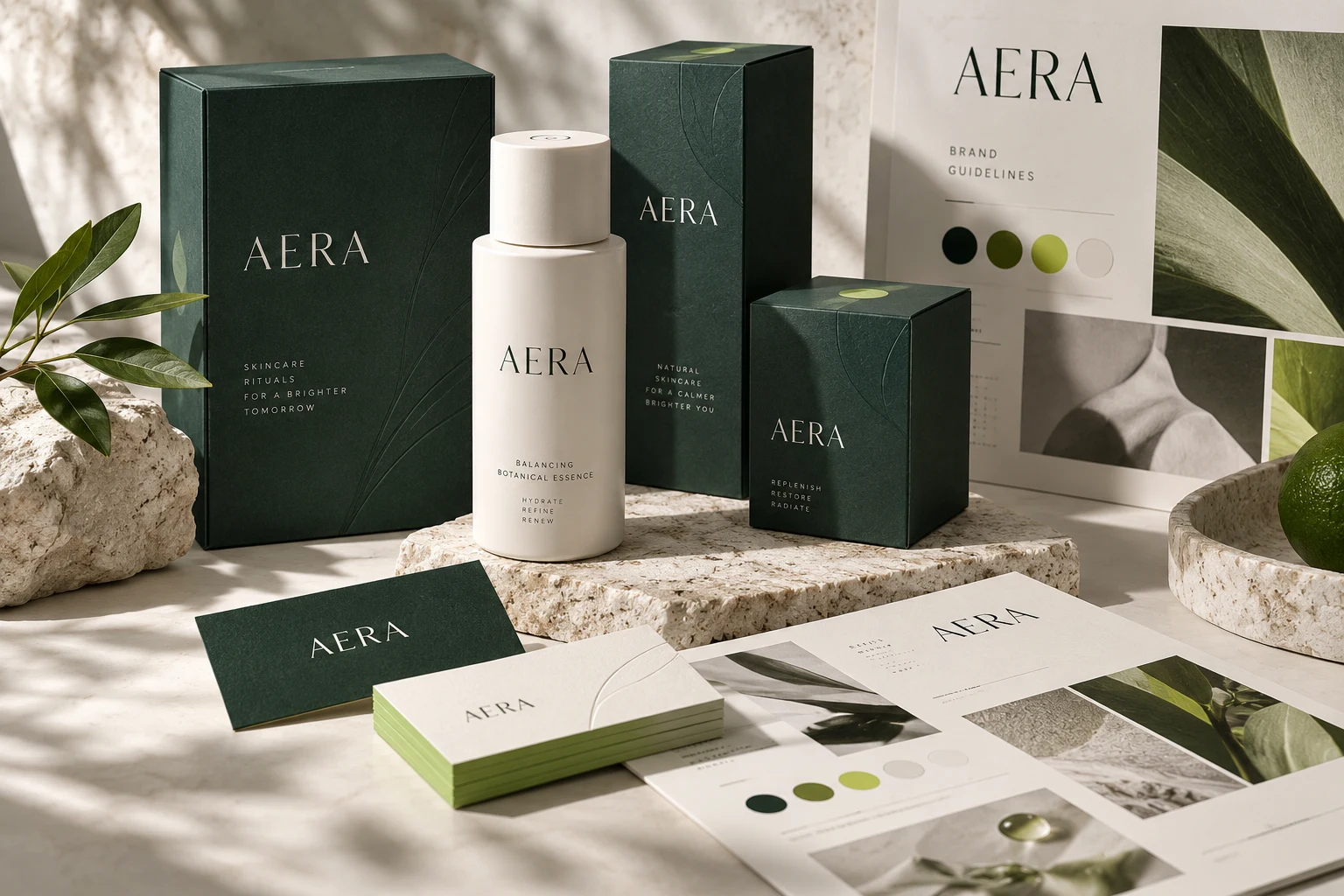
Packaging, social posts and stationery often develop separately. This study explores how a shared palette and typography can make the whole brand feel consistent.
Deep green and ivory establish the visual foundation. Restrained type and clear information hierarchy make room for product names and essential details.
An identity project in this direction could include logo variations, colour and type guidance, packaging artwork and reusable social layouts. Production artwork would need a separate technical review.
Use this study as a starting point. Your audience, goals and brand will shape the final project.
Discuss a similar project